


Blog: November 2013
Converting Sales Online, Part I
November 21, 2013
My company runs hundreds of e-commerce stores for promotional products and wearables, and I’d like to share with you the big, dirty secret of online sales in this industry: A huge portion of online transactions don’t actually get completed online. How can it be an online transaction if it doesn’t get completed online? That’s simple: If it starts online, it’s most likely counted as an online transaction. But if it doesn’t finish online – if the final amount isn’t calculated and paid for right then and there – what is it, really?
We call it a hybrid transaction, and it’s part of a big, gray netherworld of e-commerce that lives somewhere between the instant gratification of buying a Blu-Ray from Amazon and the laborious process of buying and configuring a car online. It often doesn’t sort out neatly and, for a lot of distributors new to selling online, this is a big problem. Too many businesses enter the e-commerce world hoping that the vagaries of selling face-to-face will simply go away and sales will magically get done right just by moving them online.
They don’t, and they won’t. Selling promotional products and wearables online is just as complex and maddening as selling them in the real world, but with an added twist: Your customers have been conditioned by the Amazons of the world to expect it to be fast and easy. When it isn’t, they tend to do what they do with any other website that frustrates them – they walk away. This phenomenon, known in web jargon as “abandonment“, is inevitably the primary problem for anyone selling online.
Bye Bye
Abandonment is easy for a consumer. Relatively few of your prospects hang up in your face on a daily basis, and even fewer start an anonymous sales inquiry process with you and then just disappear into the ether, never to be heard from again. In either case, you often know who they are, and at the very least you can follow up with them and ask them what went wrong.
Not so with online customers; you usually don’t know their identity, and they come and go at their leisure, sometimes starting a process one day and finishing it weeks later. Sure, there are some tools out there (some of them free; many of them quite expensive) that provide more detailed insight into visitor behavior, but with privacy rules growing ever tighter and the “creep” factor a constant risk, you have to adjust to a different reality – a reality with higher expectations for you and lower risks for your customer. In some ways, it’s the worst of both worlds.
Don’t despair – over the next few posts, I’m going to show you the best practices for dealing with the complex reality of online sales. This won’t be about getting customers to your site; I’ve covered that before in my columns on SEO. This is about what you do with them once they get there – using every means you have at your disposal to get your hooks into a customer before they give up and leave.
Some will leave, of course, and if you sell anything, you know that to be the case with any channel. You won’t always have the most competitive price, the strongest message, or the best offers. To succeed, you’re going to have to recalibrate some of your ideas about what constitutes success online, and open your mind to new kinds of sales cycles. If you’re willing to think differently about online sales, you’ll be rewarded with more sales, better loyalty and less of that cursed abandonment.
Background
Before we dive into strategy, let’s get a few definitions out of the way. For our purposes, any sale that materially occurs online is an online sale. The technical term for what we’re doing here is “attribution”, and attribution is actually a complex topic for anyone who sells online – you might run a print ad directing users to your website to get a special offer, and then a user buys the product on the site. Is that an online sale or a sale that started offline? What if the user went to the site but then the payment was taken over the phone after some details were worked out via email?
See what I mean? Because websites are ubiquitous (and have replaced phone books for finding most businesses) it can be hard to isolate a sale as being web-only. Certain types of products and transactions lend themselves to web-only attribution; for instance, a company store sale of a single t-shirt or an inexpensive custom pen order. But for many other types of transactions, the breakdown isn’t nearly as clean.
To keep things simple, we’ll be talking about anyone who comes to your website, at any time, and winds up buying the thing they looked at. They might buy it right then or a week later. They might check out through your cart or they might finish the order through phone, chat or email. No matter – they are an online customer for our purposes.
If you believe the numbers that PPAI provides, some 20% of all sales in this industry are online. That’s a huge number – almost four billion dollars worth – and is far above the average for most U.S. businesses. It’s somewhere between the most aggressively e-commerce-focused sectors, like books (almost half of all book sales are online) and brick-and-mortar retail giants that also sell online (Norstrom, for instance, pegs its online sales at about ten percent).
Whatever it is, it’s big (even if it’s half of what PPAI estimates) and I’m sure you’d like to get a chunk of it. But selling promotional products and wearables online can be challenging. Why? Here are a few reasons:
First, product data is a mess. Industry suppliers are still behind the curve in their ability to deliver high-quality product data to distributors. That means you’re either doing a lot of “massaging” (if you have the staff) or you’re using a more generic solution that already has all the data built in (in which case you’re probably suffering on the acquisition side because of poor search performance).
Second, configuring products online is tricky. Simple products and inventoried items are often no problem, which is why low-end orders and company store orders are commonly completed online. But the same customer that happily plugs in a credit card for an $85 pen order is going to hesitate before putting in that same credit card for $1200 worth of golf shirts. They’re just not the same thing, and our experience is that once you get around the $400-500 mark for an order, a customer wants to get a real person involved. You can’t blame them – a $1200 screw-up is a completely different ball of wax from an $85 screw-up.
Challenges, of course, create opportunities, and that’s what we’ll be focusing on for the next few posts. Once you accept the hard realities of selling these products online, the strategies and tactics to keep customers in your sales cycle become much clearer. Stick around; next time we’ll dig into one of the most important tools in your arsenal, calls-to-action, also known as CTAs.
– Brent Buford
A version of this article also appeared in Identity Marketing magazine.
Categories: Articles
Tags: abandonment apparel e-commerce promotional products shopping cart
The Web is Getting Simpler
November 12, 2013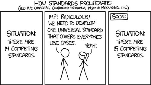
Courtesy: XKCD.com
For decades now, the internet as we know it has grown more and more complex – websites add bells and whistles to attract users and keep them around, creating a virtual arms race of features. It’s a huge mess for web developers (trying to make sure everything works in every web browser) and has a pretty significant downside for users as well; as the web matures and everyone learns how to navigate it, we all just want to find what we need. Frivolous eye candy often gets in the way.
Thankfully, this is beginning to change. Sites are cutting down on their window dressing, ripping out Flash presentations and generally adopting a cleaner, simpler look and feel. And the technology behind websites is coalescing around standard ways of building things – still very complex, to be sure, but with far less variation than before.
Like warring government departments that each have a different form to accomplish the exact same thing, web development has for years been a clash of competing standards, browsers and plugins, with each party advocating for their own solution. Microsoft won an early edge in the browser wars and pushed proprietary technology that could only be used in Internet Explorer. If you wanted to run this payroll program or that CRM site, you had to use Windows and Internet Explorer. This was Microsoft’s way of locking developers into their toolkit – develop only for Explorer, and we’ll give you access to technology you would otherwise have to develop yourself.
You can’t really blame Microsoft for this; this was simply their way of doing business with their operating systems and applications, so it made sense for them to take the same philosophy to the web. If you have the dominant browser, why not force everyone to adopt your technology to build web sites? You give the browser away for free (and bolt it into the operating system) but sell everything else needed to support it: operating systems, applications, development tools, and so on. It worked well, and Internet Explorer came to dominate the browser landscape.
And then something happened: mobile. It’s not an exaggeration to say that the emergence of usable, popular mobile computing devices (beginning with the iPhone) caused the single largest upheaval in computer technology since the advent of the internet itself. Sure, there are other factors – Google set its eyes on Microsoft many years ago, and it was perhaps inevitable that alternative browsers would regain a foothold eventually.
But mobile was an end-around that fooled nearly everyone and took off for the end zone. Mobile web traffic didn’t account for much the first few years, but tablets (another mobile device) changed that. Depending on whom you ask, mobile devices now account for 20-40% of worldwide web traffic – huge numbers either way.
Keep it Simple
So what does this have to do with simplicity? Web developers (and site owners) must account for big monitors, small laptops, a half-dozen tablet formats, and scores of smartphone screen sizes. Nothing is dominant – no device, technology, size or format is popular enough to get in the driver’s seat and dictate the way things should be done. The audience is so fragmented that a lowest common denominator approach seems to be the only way to reach all of them.
And that is, in effect, what is happening. Web developers are increasingly adopting standards for getting things done and, perhaps just as important, simplifying their presentation of information so that a site functions similarly across all devices. A fancy interactive doodad that looks awesome on your PC monitor isn’t nearly as impressive when a big chunk of your audience can’t see it. And because so many users now interact with websites using touch (instead of a mouse), all those nifty tricks that developers used when your mouse “hovered” over something get thrown out the window.
To be sure, this isn’t happening everywhere. Giants like Amazon have the budgets to develop web site versions (and even apps) for just about every type of device, and there are still companies pushing their own agenda and technology in hopes that it will dominate the web. Indeed, Google, for all its talk of open standards, often walks away from the ones it doesn’t like.
But the vast majority of website operators are beginning to embrace the obvious: The only way to be everything to everyone is to keep things simple enough that they work everywhere.
Nuts and Bolts
What does this really mean to you, the average website owner? After all, “simplicity” is a vague term that could describe a broad range of characteristics. Here, then, is a list of ways to simplify your site and make it work in more places:
- Flash remediation: This one’s easy – Flash doesn’t work on many mobile devices, and Adobe has largely abandoned it. You should too. If you can’t live without Flash-y animations and doodads, replace them with HTML5 versions, which work on most modern devices. A great program for creating Flash-style animations is standards-compliant HTML5 is Tumult’s “Hype”. Other options include Adobe’s Edge Animate and Google’s recently announced Web Designer.
- Modernize: If your site was built, say, 6-8 years ago and you haven’t touched it in a long time, have a web developer take a look at it and determine if they can bring you up to modern CSS & HTML (don’t worry, they’ll know what that means). Just bringing your “foundation” up to date will result in better functionality across many different types of devices.
- Dump complex menus: Fancy “flyout” menus (the ones that expand to show you a big list of sub-options when you move your mouse over them) might look neat on your computer, but they often don’t work at all on other devices, or work poorly. If you must use them, ask your web developer to turn them off on mobile devices, because their behavior can be unpredictable. More importantly, remember that we live in a Google world – users look for things using search features. Don’t put too much time into building eye-pleasing ways for users to navigate your site; chances are, they are going to search for what they need and ignore anything that gets in the way.
- Simplify your layout: The web isn’t like print; you can’t count on what you put together looking the way you expect it to look. The best way to ensure that a user sees what you expect them to see is to keep the layout as simple as possible – navigation, a couple columns of content, and a footer (the bottom of the page). Simple, straightforward layout is the best way to future-proof your site. The next step is making that layout responsive, but that’s a topic for another column.
- Content is king: We’ve all heard it, especially when it comes to SEO, but content is king in layout as well. Look at the most popular retail sites online: images are big and bold, product is front and center. If anything, modern web design isn’t as much about the “design” of site elements (buttons, navigation, etc.) as it is about building things around the content. For a long time, web design was new and interesting and a place where designers flexed their muscles and showed off their chops. Now it’s about getting the information or product in front of the visitor as quickly and simply as possible.
- Remove friction: In fact, most current web technology and design advances are all about removing friction from various processes. Want to share something? Hit a single button. Like something? Again, a single, quick button. Users know what they want to do, and the best thing you can do as a site owner is make sure you’re not getting in their way.
– Brent Buford
A version of this article also appeared in Identity Marketing magazine.
Categories: Articles
Tags: