eBlox e-commerce blog
Jump to a topic:
-

2024 year in review
We dig a little bit deeper into some of the company store and redemption store metrics from 2024.
-

Announcing Comprehensive SSO (Single Sign On) Support
eBlox announces comprehensive support for SSO (single sign on) for all storeBlox company stores.
-
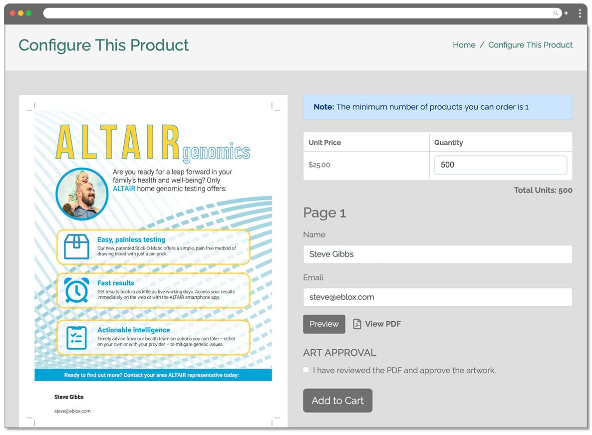
Press-Ready Web-to-Print Now Available
Press-Ready Web-to-Print Now Available Business cards, postcards, sell sheets and any other kind of printed collateral can now be added to your company store! Complete support for any type of print document: Simple management: Print fields managed in Adobe Acrobat using the PDFLib plugin (available for both Windows and Mac). Just add fields or convert…